Icon Block Settings Overview
In this article we’ll go over each setting for the custom Icon Block included with WPIcons, and how you can adjust each setting to get your desired look. You’ll see in the screenshot we’ve added an icon to a page using the custom icon block. When selected you’ll see the icon block settings in the right hand panel on your screen.
Icon
Change Icon
In the Icons Section is where you’ll find the ability to swap out icons with any of the icons you have installed on your site, or with an icon from a third party icon service (if you are a plus or ultimate license holder and have connected to a service).
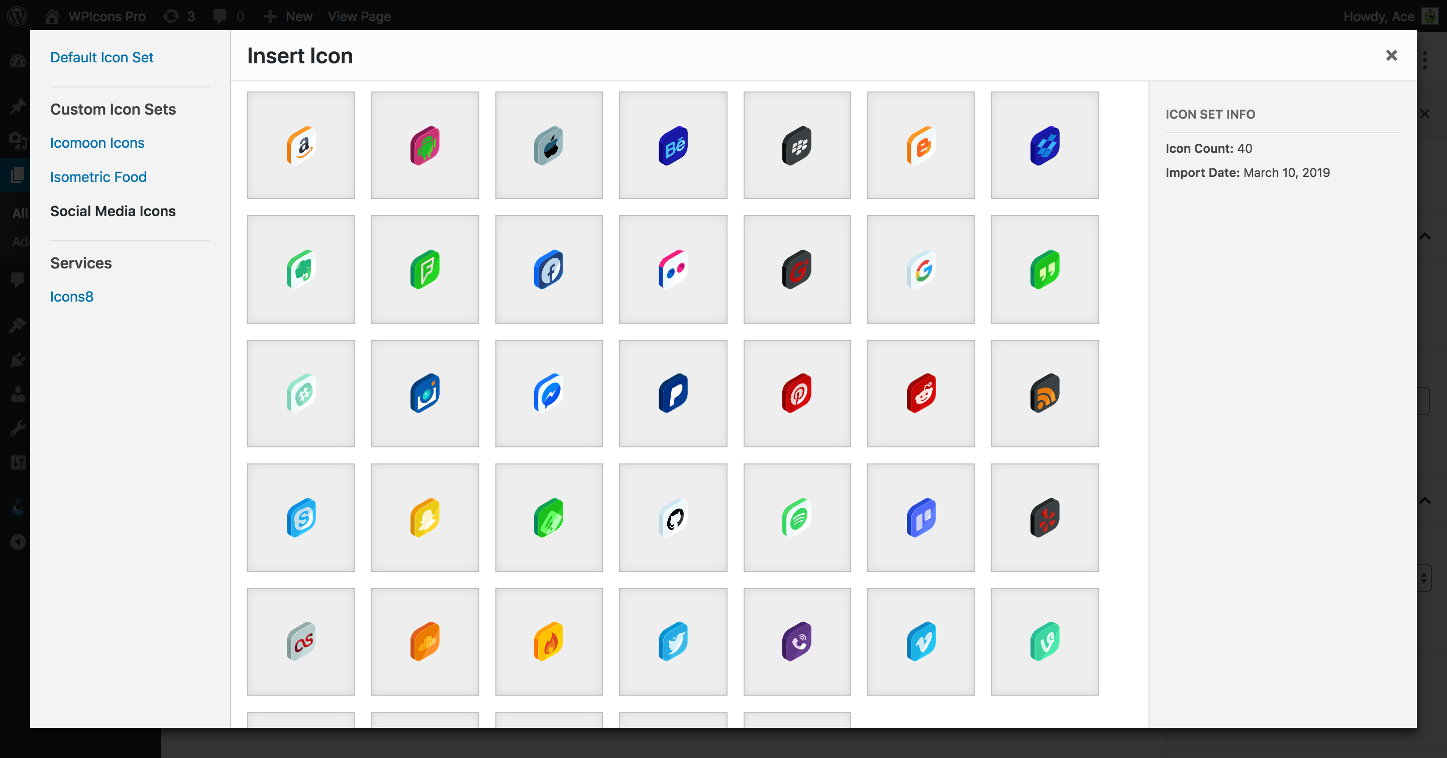
Clicking on the Change Icon button will bring up the icon browser, allowing you to view all of the icons you have installed on your site.
Icon Size
Adjusting the icon size is as simple as sliding the icon size slider to the left or right. You can slide it to the left to shrink the icon, or to the right to enlarge it. You’ll find that the icon slider stops at 200. We found this to be a reasonable size for most icons. If you need a larger icon size, you can simply enter the desired value in the text input field to the right of the slider. There are no limits when manually entering a value. (see demo below)
Animation
The Animation section has a few different settings that you can use to add an animation to your icon and trigger it at certain points. The first setting you’ll find is the Icon Animation dropdown, which is used to add the animation to your icons. Next is the Loop Animation setting, used to loop the icon animations. And finally, the Icon Animation Event which is used to control when your icons will animate.
Let’s investigate each setting a big further.
Icon Animation
You can click on the Icon Animation dropdown to reveal all of the possible animations you can add to your icon. We have included over 30+ animations to choose from, which include loop-able animations, animations in/animations out and some whimsical animations. Take a look at the quick demo of adding an animation to an icon.
Loop Animation
The Loop Animation checkbox does exactly what it says. Checking this option will cause your animations to loop repeatedly. Looping animations is great for things like rotations or pulse animations.
Here’s an infinitely looped pulsing heart icon as an example.
[wp-svg-icon icon=”wpicons-heart” animation=”pulse” infinite-animation=”true” color=”#e874b9″ size=”130px” icon-rotation=”0 “]
Animation Event
The animation event is a setting that allows you to control when your icon will animation. You have the ability to animate your icons on page load, when they are hovered on, when a user clicks it, or even when the user scrolls down the page and the icon becomes visible on the page.
Colors
The colors section can be used to update the colors of your font icons on the fly. Adjusting the icon colors can be done by clicking on any of the visible colors, or by clicking on the multicolored icon to bring up the color picker.
Advanced Settings
In the advanced settings you can add custom classes onto your icons, convert the icons into clickable links that lead to internal or external web pages, and control how that link opens (in a new tab or not).
Icon Classes
In the Icon Classes text field you can add additional classes to your icons, giving you greater control over the output. These classes can be used for additional styling or using JavaScript to target them for various reasons. The classes can be added using spaces as there is no need for commas, eg: class1 class2 class3.
Icon Link
The Icon Link setting is used to convert the icon into a clickable link and to dictate the internal or external URL of the icon. You can add any URLs you need here, including (but not limited to) query strings, hashes or UTM tracking data. Adding any text in the icon link field will convert the icon into a clickable link which will direct the browser to the specified link in the same window.
Open Link in New Tab
Checking this option will force the icon link to open up in a new tab when clicked. Without this option enabled the icon will redirect the user to the specified page in the same browser window. However, if you wanted to direct them to an external URL you may want to open up a new tab for them so they aren’t directed away from your site.

Advanced
The advanced tab is the default setting section included in WordPress core. You can add classes to the parent icon block, and not the icon itself. You may want to do this for various reasons, ranging from styling to a better class selector for JavaScript.